Check Out The Newly Updated RMEF Logo
OutdoorHub Reporters 08.28.19

You all know about the Rocky Mountain Elk Foundation, but the 35-year-old brand dedicated to the conservation and overall betterment of elk populations and habitat has taken on a new look with the release of an updated RMEF logo.
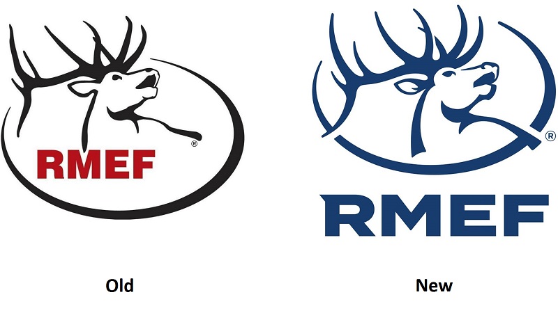
Long-time RMEF members will still recognize the foundation’s familiar elk figure profile, however the new logo takes on a more modern feel with some minor details added to the head and it looks like the elk’s g8 grew a little through the years. Also, the ‘RMEF’ acronym has been given a much more pronounced location separate from the elk graphic, the font has more character, and the logo as a whole appears in a solid uniform color.
Check out the logos side by side to see how it changed:

RMEF collaborated with Shine United to make the revision. The new branding will be phased-in across the entire RMEF spectrum including retail, marketing, field operations and other materials as well as its digital properties including a soon-to-be-revamped website, social media platforms, email outreach and other tools.
“The RMEF brand is an iconic staple throughout the conservation world,” said Steve Decker, RMEF vice president of Marketing. “This refinement is an effort to modernize that brand while paying respect to the more than 35 years of conservation work enabled by our volunteers, members, partners and other supporters.”
RMEF and its partners completed more than 12,000 conservation and hunting heritage outreach projects that protected or enhanced more than 7.5 million acres of prime elk habitat with a combined value of more than $1.1 billion. Additionally, RMEF opened or improved access to 1.2 million acres of land. The organization also assisted with the successful reintroduction of elk onto their historic range in seven states and one Canadian province.

